As part of our 40th anniversary celebrations, we’ve had a bit of a makeover. But the changes are more than cosmetic. Rather, our new look is tool to help move towards a vision of transport justice for all disabled people, as well as an homage to the incredible history of our community. Every new feature has a story behind it, and has been coproduced by Transport for All members. So, without further ado, here is a tour of our new look, and the inspiration behind the brand.
Protest imagery
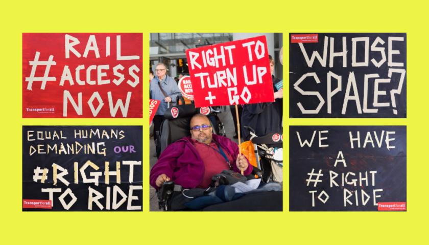
Throughout our website you’ll see an electrical tape pattern/texture. This is inspired by the iconic protest placards created by artist and Transport for All campaigner Anahita Harding that have been used in some of our most successful campaigns, including Rail Access Now, and which are now a recognisable part of our community’s history. It evokes the punky, DIY, protest-based ethos that has got us to where we are.
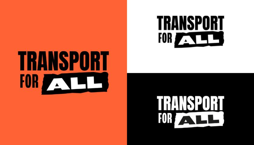
Our new logo embodies who we are as an organisation: it is bold, punchy, and says exactly what needs to be done. The strip of tape used to highlight the word ‘all’ not only emphasises our inclusive mission, but is a direct nod to these placards, where strips of tape were used to create the lettering of calls for change.
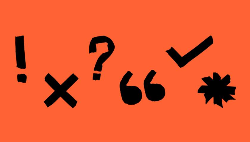
As well as our logo, the headers, arrows, and punctuation marks on our website are all made from digital scans of electric tape. This not only pays homage to the punky, DIY spirit of protest from which our organisation was born, but allows us to carry that spirit forward into the future, as members continue to use tape to make placards and signs for future campaigns. Whether you’re taping a banner to take to a protest, or tweeting an arrow from your bedroom, everyone can participate in a way that is accessible for them.
Because all the arrows are made by hand, out of tape, none of them are quite the same. This reflects the Transport for All community. We’re disabled people from all walks of life, from across the impairment groups, banding together to make change. We are all different, but we are pointing in the same direction towards the same goal: transport justice for all disabled people.
Colour
The neon colours are another reference to our roots, reminiscent of eighties bands and DIY zines. Our primary colour, ‘hot orange’ also nods to transport (think traffic cones, bus poles, London Overground).
As well as being as bright, bold, and varied as the disabled community, the new colour combinations we use are significantly higher contrast than in the past, making them more accessible for blind and visually impaired people.
We also know that, while high contrast is essential for many people with visual impairments, it can also be a barrier for those with other sensory impairments. To balance these access needs, we have introduced a new button at the top of our website, which changes the colours from ‘vivid’ to ‘soft’ in order to reduce sensory overload.
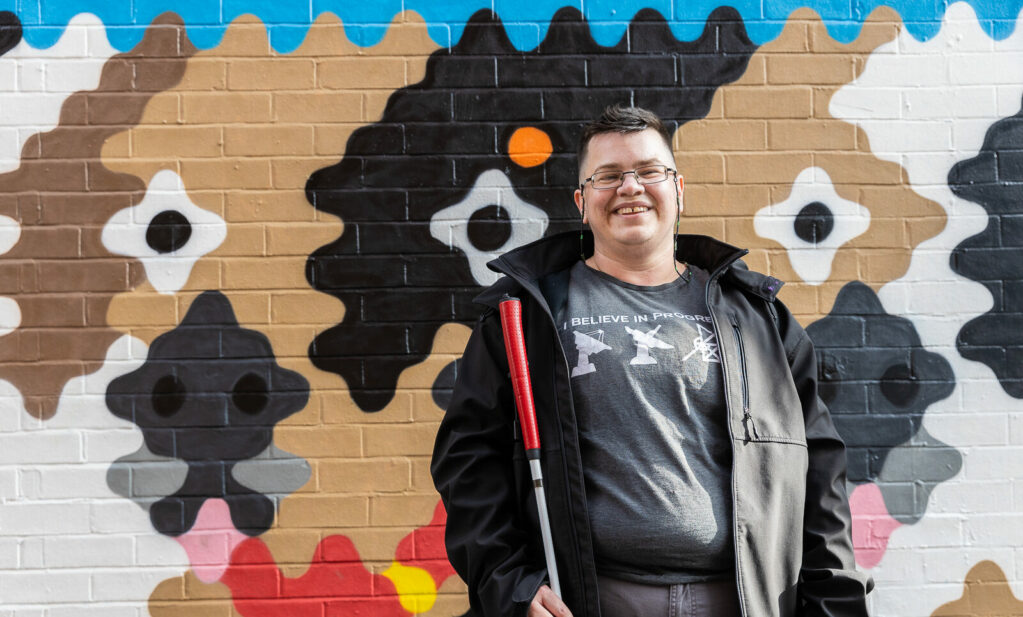
Photography
There is a tendency for photos of disabled people to be a bit… ‘inspiration porn’-y. We are often photographed with lens flares and soft focus and framed very much from the perspective of a non-disabled person. We set out to change this.
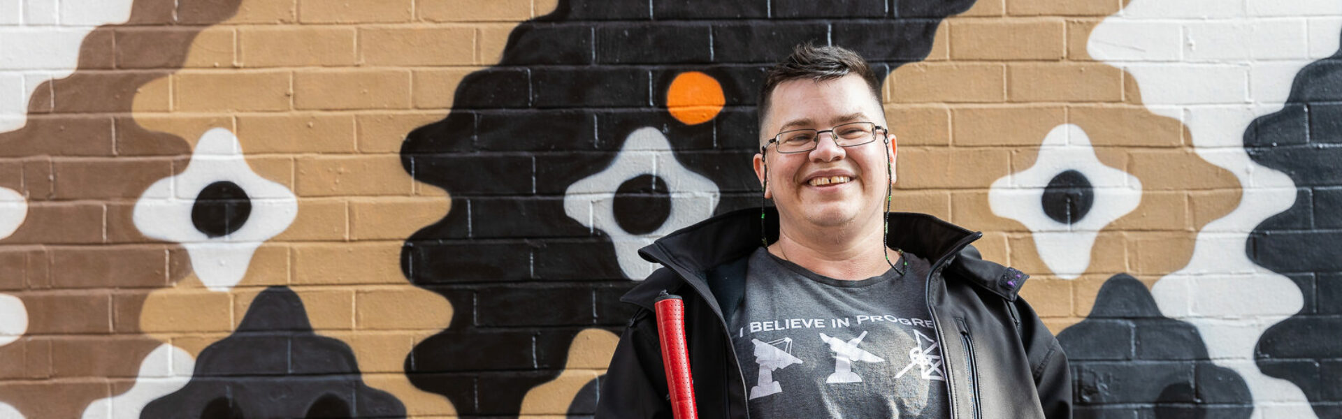
Featuring members from across the country, our new photo library is reflective of the diversity of the disabled community: across impairment types, mobility/disability aids, ethnicities, genders, ages, sexualities, cultures, lifestyles, and backgrounds. We are Transport for All, and everyone is welcomed and represented in our work and membership.
Thank you to the members who took part, and to the talented Shona Louise, a disabled photographer and writer who shot these powerful images. You can find more of her work here.
Support us
We can't do this without your support. Take action, give what you can, or sign up as a member - and join our movement of disabled people fighting for a better future.